Wednesday, April 29, 2015

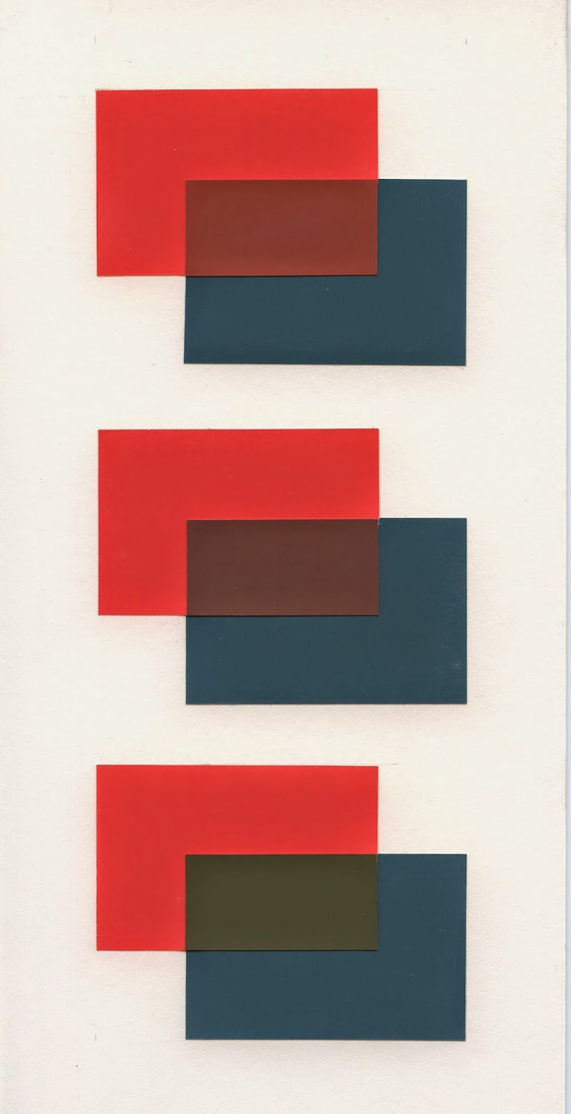
Assignment 8 - Traditional and Equivocal Space


Traditional Space

Stephen Wilder
Assignment 8 - Traditional and Equivocal Space
April 29, 2015
SVSU ART 111-01 - Hanson


Equivocal Space (Adobe Illustrator)

This form can be resolved as traditional space with the exception of the overlap of the upper right dark square.  This overlaps the lighter squares, which should be in front of it.  Done in Illustrator as an exercise, as the gradients would have been nearly impossible to achieve with ColorAid paper.


Monday, April 13, 2015

Assignment 7 - Vibrating and Disappearing Edges


Stephen Wilder
Assignment 7 - Vibrating and Disappearing Edges
April 13, 2015
SVSU ART 111-01 - Hanson

This project explored the use of vibrating and disappearing edges. By using two colors with similar like intensities but varying hues the edges of the composition and either disappear or vibrate when looked at.

For the vibrating inches project I used a composition developed in project 2. This composition was completed using blue, red, and green hues.  The vibrating edges in the final composition did not appear as strong as they did in early mockups which was disappointing. Even with the issues with the hue selections there are still interesting vibrations occurring as the line weights vary. 

The disappearing edges composition turned out much better. I chose very saturated hues for this project to explore how that would work out. Also for this project chose the composition that had numerous concave and convex shapes as well as shapes within the field of background color.  At a distance this composition turns into a murky field of deep saturated blue. At different distances, the composition drastically changes in appearance. The edges disappear fairly well with these hues. 

Wednesday, March 11, 2015

Project 4 - Color Interaction

Stephen Wilder
Assignment 3 - Color Interaction
March 11, 2015
SVSU ART 111-01 - Hanson

Please note that the following digital images are likely not as effective as the physical works.

Part 1 - Bullies and Pushovers.  This color shifts toward red on the green background, and more toward blue on the red background.


Part 2 - Make 2 Colors Appear the Same.  Color on left is more green, color on right is more orange.


Part 3 - Parent/Child Relationship.  Find a color that looks like the opposite color when viewed on the opposing background.


Wednesday, February 18, 2015

Assignment 3 - Gradients


Stephen Wilder
Assignment 3 - Gradients
February 18, 2015
SVSU ART 111-01 - Hanson

With this project, we had to create a gradient from 0% (white) to 100% (black).  The second part of this assignment was to take a previous composition and remake it using gradients.

For the gradient portion, the hardest part I had was finding achromatic magazine clippings.  Even with a stash of Vogue magazines "borrowed" from my little sister, I still had to settle for some greens and pinks, especially near 40%.

The second part had some neat effects.  For instance, the gradients on the "F" shape disappear, as the contrast changes from left to right.  What's interesting about this part of the assignment is that it could be done a dozen times and have a dozen different outcomes.  That's just a statement, not a suggestion...

Here's a comparison between the Assignment 3 and Assignment 2 compositions:


------------------------------------------

Formative Exercise:


This formative exercise helped set the 50%, and then 25% and 75% values for the gradient project.  My 50% value may be a bit on the dark side, but setting these values early helped with completing the assignment by breaking down the "hunt" for more values.

I was inspired by "digital camo" for my pattern for the gradient exercise.  An example can be seen on the US Navy jet here: 


To accomplish this for my assignment, I made a simple jig out of matboard, shown below.  Cutting the magazine clippings with this jig was not difficult, it actually made things simpler.  Although this whole process was rather tedious, I am quite pleased with the results.


For the sake of conversation, above is the gradient exercise with no colors (desaturated).

Wednesday, February 11, 2015

Tools, Tips, and Techniques

Here are a few of the tools and methods I've used to complete the cut paper projects for 111. 

These are the most important tools I use - tracing paper, tape, a small stainless steel ruler, single-edge razor, and tweezers. The leather punches shown can be used to make small circles. 

The first step is to transfer the design to tracing paper. 


I do the transfer method for a handful of reasons. This keeps the original design intact as a reference, allows me to incorporate overlaps, and allows shared cuts for more efficiency. 

Before cutting, I tape the magazine page to the cutting board. Stretching the paper as tight as possible is key here. 

With the paper taped down, I then tape the template over top. Notice that I'm using the edge of the page for a "cut" - this saves time. Why make cuts you don't need to?

The video below shows the cutting process. The tracing paper is sacrificial. I try to do short cuts first, and pay attention to the cuts that free the pieces - doing these incorrectly can allow the magazine paper to pull and tear.